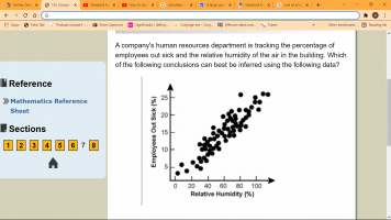
A company's human resources department is tracking the percentage of employees out sick and the relative humidity of the air in the building.....

eddy2017

Elite Member
Joined
Oct 27, 2017
Messages
2,525
1645990899459.png

  1. High values of relative humidity cause people to become sick.
  2. When many employees are out sick, the relative humidity tends to be high.
  3. Many employees are getting sick from the mold and mildew in the building.
  4. The negative affect of overcast, sunless days is influencing employees' health
this scatter plot is rather confusing.
I looked up the answer before I pasted here( which I never use even if the exercise carries an answer because that defeats the whole purpose of my reason to post here. Besides, you may see the answer and not know a blessed thing about why that is the answer.
well, this is a typical case
the answer given as correct is B >When many employees are out sick, the relative humidity tends to be high.
I have studied scatter plots, but what i have learned is not enough to see why is B the answer
on the y axis of the scatter plot th highest percent of sickouts is 25 % and the relative humidity let's say it goes up from 80 % but I don't see the connection. Where both parameters meet the scatterplot dots are not so tightly together. there are tighter spots.
What am I missing in this picture?
thanks in advance,
eddy
 
If you were to draw a "best" fit line to fit the data, you would see a line y=mx+b with a positive slope. This means that the relative humidity and employees out sick are strongly correlated. In order words, as the relative humidity increases, the % of employees out sick also tends to increase. Thus, B is a fair statement to make.

An important concept from statistical inference is "correlation does not imply causation", meaning seeing two variables moving together does not necessarily mean we know whether one variable causes the other to occur. It may result from random chance, where the variables appear to be related, but there is no actual underlying relationship; or there may be a third, lurking variable that makes the relationship seem more potent than it is. Therefore, statement A is not necessarily true.

The plot does not tell us how mold/mildew in the building or overcast days are affecting employees' health has anything to do with employees being out for sick. Therefore, those are wrong.
 
Last edited:
If you were to draw a "best" fit line to fit the data, you would see a line y=mx+b with a positive slope. This means that the relative humidity and employees out sick are strongly correlated. In order words, as the relative humidity increases, the % of employees out sick also increases. Thus, B is a fair statement to make.

An important concept from statistical inference is "correlation does not imply causation", meaning seeing two variables moving together does not necessarily mean we know whether one variable causes the other to occur. It may result from random chance, where the variables appear to be related, but there is no actual underlying relationship; or there may be a third, lurking variable that makes the relationship seem more potent than it is. Therefore, statement A is not necessarily true.

The plot does not tell us how mold/mildew in the building or overcast days are affecting employees' health has anything to do with employees being out for sick. Therefore, those are wrong.
Yes, you're right. Thanks a lot, [math]BBB^2[/math]
 
If you were to draw a "best" fit line to fit the data, you would see a line y=mx+b with a positive slope. This means that the relative humidity and employees out sick are strongly correlated. In order words, as the relative humidity increases, the % of employees out sick also increases. Thus, B is a fair statement to make.

have not noticed that. thanks
 
Top