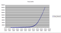
Covid-19 death rates graph

Chris Knight

New member
Joined
Apr 19, 2020
Messages
4
1587318174818.png1587318174818.png

The Total Deaths trendline slope is y=6667.4x - 3E+08 - what's the best way to describe it in plain English? I realise it is a mean rate of 6667.4 per day less another constant factor, 3E+08, which I suppose is 3E^8, but I am out of my league here.
 
#1 - "linear trend" and "seems to be steepening" are mutually exclusive concepts.

#2 - "Doubling Time approximately 10 days" isn't demonstrated in the data. In the beginning, it's more like 6-7. At the end of your data, it's more like 14.

#3 - You found the "Display Equation on Chart" check box. Now, find the "Display R-squared..." and turn that on, too. This will tell you how much you actually care that it may appear to be this linear relationship suggested in the equation.
 
@tkhunny thanks for your comments, it's a live graph changing day by day as the various international sources correct their data, and my comments on the data get out of date almost immediately, I had just included the latest figures, and I shall remove or qualify the comments. the regression line for daily totals seems pretty good to me. Deaths per day are subject to huge sampling error, so the correlation is not going to be great.

1587328830283.png
 
Last edited:
The difficulty is in:
1) Misleading, whether intentional or not.
2) Providing comparisons that are actually valid.

Everyone tries to explain stuff, generally to fit their own agenda. You may be motivated just by trying to understand. That's the best motivation. :) It is a VERY difficult thing to capsulize data with SO MANY influential factors down to just one 2-dimensional chart.
 
If the graph of total deaths is approximately linear, as your R^2 value of 0.9956 suggests, that simply means that the number of deaths per day is approximately constant. That is what your main graph shows, though obviously that is far more variable, as would be expected. The R^2 of 0.2763 means that you can't conclude confidently that there is any real trend there.

For a linear function, doubling time is essentially meaningless. That is significant only for an exponential function, whose doubling time is constant.

In reality, a nearly constant death rate is pretty much what one hopes to see at this stage in an epidemic, because we can hope to manage a constant number of deaths (as long as it is within our health system's capacity). The fear is of exponential growth, which would sooner or later overwhelm the system. What I see in your graph is that "the curve has been flattened", more or less. It isn't ideal, but it is far better than it could be.

It happens that I wrote about the various kinds of graphs we see online in my blog last week, at https://www.themathdoctors.org/reading-pandemic-graphs/ . I tried to avoid over-interpreting the graphs I showed, because graphs overlook so much (from individual lives, to data collection errors, to the underlying science); the main point is to avoid reading the wrong things into a graph by failing to see it for what it is. I didn't make any graphs of my own showing trend lines and R-squared, though that could have been interesting.
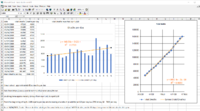
 
@tkhunney I thought that it is pretty straightforward. International sources present incomplete data daily to a central repository which compiles daily totals, and corrects them when the full data reaches them. In the meantime, an attempt to show the trends will allow forecasts to plan for the expectations over the next few days. It is pretty difficult to argue with the death data, it is concrete, maybe days late, but undeniable. Just dealing with daily death data will feed back into even less complete infection data (since death rate for this disease is likely impossible when there is no satisfactory number of proven cases to make a comparison with, in the record, when even the richest nations do not have the capability for testing, and when a large number of cases are probably asymptomatic.)
@Dr.Peterson I would agree with you, except that the quantitative majority of data is coming from China, Europe and the USA, who are on various stages of the first wave, and there are many other, less wealthy nations, to put it bluntly, who are just joining the pandemic. Who will supply their health workers with PPE? Beyond that there is the question of the second wave in the countries in the Northern hemisphere who have been stricken, locked down and have shrunk their future economic growth to such an extent that people are fearful of their future beyond the pandemic, and to maintain order are considering relaxing the lock-down.
This is the complete data series: 1587335022186.png
 
Did I say anything to suggest that there's nothing to worry about? And had you said anything about your conclusions in your initial question, that I might be disagreeing with?

My point was merely that linear growth in the total, corresponding to approximately constant new deaths, shouldn't be confused with exponential growth. The graph you show looks like near-linear growth to me (after initial exponential growth). It's still not good, and it may well get worse. We just don't want to overstate the case, or to use bad math.

There's enough to be concerned about in the things that both you and I have mentioned -- as I expressed it, "graphs overlook so much (from individual lives, to data collection errors, to the underlying science)", and as you said, the data are incomplete and things will change as poorer countries are affected. I agree. But that doesn't make your interpretation of the graph correct.
 
Thank you @Dr.Peterson for your comments, which I have taken on board, and the link to your excellent analysis at https://www.themathdoctors.org/reading-pandemic-graphs/
Outcomes are manageable since they release beds for new patients, the initial growth in hospitalised patients has been difficult for those involved in healthcare, who have put their own lives at risk, who deserve the greatest praise.
 
Last edited:
Top