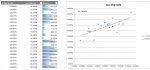
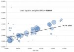
I have minimal statistics schooling but i am attempting some analysis on the correlation between data sets using Excel. This i have managed to achieve using the RSQ function. However I would like to weight each data point depending on the 'sample size' (amount) :

I have found that when I compare r-squared with the say the top 10 data points by amount, the correlation is generally stronger with fewer outliers. However i still would like to calculate r squared based on the larger data set but weighted by the amount.
I hope this makes sense. Thanks in advance to anyone who spends time helping me with this.
Dan