Hello everyone,
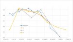
I have a graph.
The blue line created from measured values.
All over created from calculated values obtained from 3 different sources.
The red line is the best.
The gray one is ok.
The yellow on is ok in the middle, but the first and the last points are not good. Because of that, I have to drop this line and its good values from the graph.
The point is to create a combined line from all the calculated values which must be as close to measured values as possible.
So, would you mind to advice how can I adjust the yellow line formula using other lines formulas? I would like to make these 2 points closer to the blue line.
Thank you!
Attachments
Last edited:
")