Little_Louis
New member
- Joined
- Mar 26, 2022
- Messages
- 15
I sat an online test at work, and there were some questions I struggled with. This was one of them. After the test, I discussed this question with a friend, who told me I was wrong - so I want to find out why I am wrong.
Question: Consider the frequency distribution of heights of a large sample of men and women aged 18 years. Which option is correct?

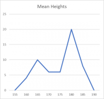
x axis = height in cms of large sample of men and women aged 18yrs; y axis = frequency
Note - I called the graph 'mean heights', and it's my attempt to recreate the data in excel, the original was a classic nice looking bimodal shape.
I chose option 1 because...
1. This is a classic bimodal gender/height chart, and shows two distributions (it states a large sample of men and women aged 18 years). We studied this graph in my early stats studies, hence my thinking, and I can see that that there is the female mode at 165 and male mode at 180. If I separated the two distributions, I'd expect the male mean to be fairly close to the mode, so it would be greater than 172cms.
2. I can't tell if there are more males than females.
3. I disputed question 3 because if there are two distributions, then there are two modes, two medians, two means. However, if we were going to say this was one distribution, we have a left skew, so this would indicate the mean < median < mode, so 3 is wrong.
4. The interquartile range is less than 30 cms, for the whole distribution, and for the two distributions. However, this answer doesn't refer to the sample, and the other three do. Throughout the test, this seemed to be a key point that the choice always included reference to the sample, but maybe I'm being pedantic.
My friend said 'no way is it no 1 because you're making assumptions that you don't know at this stage.' He said no. 4. I said 'no way is it no. 4, because it doesn't say it belongs to this sample and it's two distributions'. What do you think? Thanks in advance.
Question: Consider the frequency distribution of heights of a large sample of men and women aged 18 years. Which option is correct?
- The mean height of males is greater than 172cms in the sample
- There were more males than females in the sample
- The median height is less then the mean height in the sample
- The interquartile range is less than 30 cms

x axis = height in cms of large sample of men and women aged 18yrs; y axis = frequency
Note - I called the graph 'mean heights', and it's my attempt to recreate the data in excel, the original was a classic nice looking bimodal shape.
I chose option 1 because...
1. This is a classic bimodal gender/height chart, and shows two distributions (it states a large sample of men and women aged 18 years). We studied this graph in my early stats studies, hence my thinking, and I can see that that there is the female mode at 165 and male mode at 180. If I separated the two distributions, I'd expect the male mean to be fairly close to the mode, so it would be greater than 172cms.
2. I can't tell if there are more males than females.
3. I disputed question 3 because if there are two distributions, then there are two modes, two medians, two means. However, if we were going to say this was one distribution, we have a left skew, so this would indicate the mean < median < mode, so 3 is wrong.
4. The interquartile range is less than 30 cms, for the whole distribution, and for the two distributions. However, this answer doesn't refer to the sample, and the other three do. Throughout the test, this seemed to be a key point that the choice always included reference to the sample, but maybe I'm being pedantic.
My friend said 'no way is it no 1 because you're making assumptions that you don't know at this stage.' He said no. 4. I said 'no way is it no. 4, because it doesn't say it belongs to this sample and it's two distributions'. What do you think? Thanks in advance.
