You are using an out of date browser. It may not display this or other websites correctly.
You should upgrade or use an alternative browser.
You should upgrade or use an alternative browser.
Need a little help with a graph
- Thread starter Ramses823
- Start date

stapel
Elite Member
- Joined
- Feb 4, 2004
- Messages
- 16,543
I've been out of school for a while and I need some help trying to figure out how to use this graph I'm embarrassed to say that I don't even know where to start any help would be appreciated View attachment 36990
What are you supposed to be doing with this chart? What were the instructions?
Please be complete. Thank you!
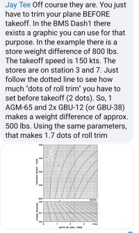
It's actually for a study level flight sim called DCS. The chart is supposed to tell me how many dots of trim to add to the aircraft, for example if I have 2,000lbs on the left wing station 7 and let's say 500 lbs on my right wing Station 3 at this point the airplane is unbalanced on one side of the wing. So to correct this before takeoff I have to apply the proper amount of roll trim, which is what the chart is supposed to tell me. Unfortunately for me I don't know how to use the graph to come up with this figure... here is a picture someone posted trying to explain it but it was very vague to me and left me scratching my head..
Attachments
Dr.Peterson
Elite Member
- Joined
- Nov 12, 2017
- Messages
- 16,971
I know nothing about dots of trim, but here's how I interpret the dotted line on the graph:It's actually for a study level flight sim called DCS. The chart is supposed to tell me how many dots of trim to add to the aircraft, for example if I have 2,000lbs on the left wing station 7 and let's say 500 lbs on my right wing Station 3 at this point the airplane is unbalanced on one side of the wing. So to correct this before takeoff I have to apply the proper amount of roll trim, which is what the chart is supposed to tell me. Unfortunately for me I don't know how to use the graph to come up with this figure... here is a picture someone posted trying to explain it but it was very vague to me and left me scratching my head..

Find 155 kts on the left side of the top graph. Imagine the slanted line corresponding to 800 lb, between the lines shown for 500 and 100 lb, and trace over to that point. (This is very much an estimate!)
From there, trace downward to the top edge of the lower graph, and imagine the slanted line passing through that point. Follow that line until you reach the horizontal line corresponding to station 3/7. From that point, trace downward and read off the number of dots.
Does that make sense to you? I know nothing about the math behind this, but that's what they're communicating to me.
Thank you for responding,a pilot on Facebook basically tried to explain the same thing to me the other day, your example is actually a little more clear, however I'm at a point where my lack of knowledge at understanding graphs is hindering me, and it's not reasonable for me to ask someone to interpret performance graphs everytime I need to interpret one. After looking for math study videos on YouTube I see there are many different graphs, what kind of graphs should I study that will allow me to have the necessary knowledge to interpret these kind of graphs?
Dr.Peterson
Elite Member
- Joined
- Nov 12, 2017
- Messages
- 16,971
This is not really a math issue; what is done here is not typical of any kind of graph you'd study in math. In particular, they don't tell you what the horizontal axis in the top graph means, so it wouldn't help much to try to use any knowledge from outside the graph.Thank you for responding,a pilot on Facebook basically tried to explain the same thing to me the other day, your example is actually a little more clear, however I'm at a point where my lack of knowledge at understanding graphs is hindering me, and it's not reasonable for me to ask someone to interpret performance graphs everytime I need to interpret one. After looking for math study videos on YouTube I see there are many different graphs, what kind of graphs should I study that will allow me to have the necessary knowledge to interpret these kind of graphs?
They have attempted to show how to use their graph, and any graph of this sort would include such instructions. Words (such as in the screenshot you attached, which did help me to be more sure of my interpretation) would be at least a little more helpful than a couple cryptic arrows on the graph, but I wouldn't say I used any special mathematical skills to figure out what they meant.
I suppose one thing that might help you is some sort of experience with reading graphs "inside-out", which is done twice in this case: Working backward from a y value to an x value using a curve. This can be described as "solving for x graphically". The concept of families of curves (which is what both graphs here show) might also help you get a feel for what these graphs mean (e.g. where we twice had to choose a curve intermediate between curves that are shown). So, yes, I guess there is some mathematical experience behind my success in understanding what they show.
One other thing: The style of usage of these graphs reminds me of nomographs, which are specialize graphical representations of relationships in which you often draw lines between points on other lines to find an answer. That's not really what this is, but the way it's used involves some similar actions, and the goal (to quickly estimate a calculation) is the same. Possibly experience with them could help you. But nomographs are basically a technique that was used before computers, and they are rare these days.
Ultimately, though, it's going to be a matter of following instructions (in this case, a visual example), even when you don't initially know exactly what you're doing, and then seeing whether it makes sense. When I teach problem-solving, I often recommend just doing something as a step toward understanding.
