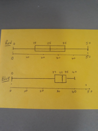
If you relied on only the median, you could conclude that, on average, the blue team were the slowest.
I have drawn the box-and-whisker plots for the two sets of data. I hope you are familiar with these sorts of plots - they basically illustrate the 5- number summary for a set of data ie, lowest, LQ, median, UQ, highest, breaking the data in quarters.
If you compare the "whiskers" at the right-hand end, you can see that the slowest 25% of students in the red team took between 35 and 50 min to finish the test. The slowest 25% of students in the blue team took between 35 and 40 min.
This complicates things a bit. Can you still conclude that, on average, the blue team are slowest?
I think "yes" when you compare medians only and because the question says "on average. But the box-plot based on the quartiles add another dimension to the question. I think there are valid arguments either way.
Also compare at the fastest 25% in each group. The fastest in red finished in under 15 min, while the fastest in blue finished in 27 min. What conclusion does that support?


