I guess you need to ask your teacher!
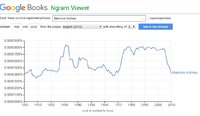
In addition, you imply that you were given this graph with no explanation beyond what the image itself shows. That is problematic in terms of the first question, as you don't know what information it gives you. We can guess; it would appear to give the percentage of ... what? Of
books published in each year that
contain the phrase "Sherlock Holmes"
somewhere? Maybe ... but maybe not (in fact, not).
Math is not about
guessing what something means; it requires definitions! If someone gives you a graph, it is
their responsibility to tell you what it means. What is the base of the percentage? What is being counted (words, books, ...)? What is the corpus (the set of data called "English (2012)")? What does "smoothing of 3" mean? If I were given this assignment, I would at least try to find the site for "ngrams" to learn what I could about it (see
here, for example); and I might, if I were bold, turn in a grade of F for the teacher who has failed to provide required information. Just as an answer can be wrong, a question can be wrong. This one is.
I'm guessing that perhaps your teacher gave each student in the class a different graph, and most of them may have made sense for the questions being asked; perhaps this graph is an anomaly, and you'll just be given a more suitable graph if you ask.