Derive an exponential equation using semi-log plotting.

writer2019

New member
Joined
Apr 1, 2019
Messages
19
Hi Guys
I need some help in deriving an exponential equation using a semi log plot. I am quite stuck on how to do this. We are asked to model Corona Virus. I have decided to do Qatar1. On the site I saw a logarithmic graph but I don't know how to derive an exponential equation from that. Can someone guide me in the right path in doing so.

Part 2:
Using differential calculus find the rates of change on your model. Find the gradient function associated with your model and make eight estimates as to the rate of change of the spread of the virus at chosen points.
Part 2 I am able to do but I am unsure on how to do the first part that is derive an exponential equation using semi-log plotting.


1: https://www.worldometers.info/coronavirus/country/qatar/
 
The details will depend on the tools you are using. For example, you might use Excel to make a trendline; or you might be expected to do it by hand with a graph on semi-log paper. Can you tell me more about the assignment, and show any work you have done?

I recently wrote about semi-log plots in my blog, at https://www.themathdoctors.org/logarithmic-graphing/, precisely because this is a timely topic! I don't cover curve fitting there, but the first example shows how to find the equation of a line on semi-log paper, given two points on it (and supposing that it is an exact line). Your situation is probably different, but the concepts may help anyway.
This is what the task requires us to do:
Your task is to model some aspect of the growth of the Covid-19 virus using an exponential equation. You should use semi-log plotting in deriving your equation.The model can apply to the world, a country or a part of a country (for example state or territory). You could also choose to model a phenomenon associated with the spread of the virus (for example, unemployment, hospital admissions, share prices).

Your model may apply to any time frame, but it must contain at least 12 data-points. The model is to be plotted together with the raw data.

Now you need to use differential calculus to determine the rates of change implied by your model. Find the gradient function associated with your model and make eight estimates as to the rate of change of the spread of the virus at those data-points.

Reading through your site I tried to do what you did with your semi-log part to one of the semi logs on mine and it just wasn't adding up/looking right. I'll attach more
 
Last edited:
The details will depend on the tools you are using. For example, you might use Excel to make a trendline; or you might be expected to do it by hand with a graph on semi-log paper. Can you tell me more about the assignment, and show any work you have done?

I recently wrote about semi-log plots in my blog, at https://www.themathdoctors.org/logarithmic-graphing/, precisely because this is a timely topic! I don't cover curve fitting there, but the first example shows how to find the equation of a line on semi-log paper, given two points on it (and supposing that it is an exact line). Your situation is probably different, but the concepts may help anyway.

Like I graphed your one out which is the red one in the image. Following the same principles I did this with a virus rate.


m=log(1072)−log(15)/34-0=log(71.46)/34

Y= (log(71.46)/34)x+2

y=10^(log(71.46)/34)x+2

I am actually quite confused on what to do
 

Attachments

  • 12.png
    12.png
    61.4 KB · Views: 3
One thing I'll need to see is your 12 data points as plotted on a semi-log graph (either on literal graph paper, or graphing the logs of the values on Desmos or equivalent), so we can see whether it looks close to linear. (Where are you getting the actual values? Are you doing total cases, new cases, deaths, ... ?)

You appear to be using two points to find an equation, which is likely what is expected; those two points should be chosen based on their being on a straight line through the data. If you had learned about linear regression, Desmos could do that for you.

Your example has the wrong vertical scale; do you know how to change it? If not, their user guide is at https://desmos.s3.amazonaws.com/Desmos_User_Guide.pdf . (Some other programs make this easier to do.) This may be your main current issue.

Also, when you plot your equation for comparison, it will be useful to plot the actual points along with the equation.

Finally, don't forget that an exponential function is not always an appropriate model. For Qatar, it should be reasonable from Mar 13 to the present

Hi,
I know it's a stupid question but I'm still confused on what to do. I have my 12 data points for Qatar. Can you explain or guide me in the right path in making that into a semi-log graph
00
13
28
312
424
5320
6394
7450
8460
9979
102980
113850
124857


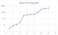
So what I did was I used this website: https://sciencing.com/make-semilog-graph-excel-12100250.html. Could you tell me if this is correct for a semi-log graph?
1587807057973.png
 
Hi,
I know it's a stupid question but I'm still confused on what to do. I have my 12 data points for Qatar. Can you explain or guide me in the right path in making that into a semi-log graph
00
13
28
312
424
5320
6394
7450
8460
9979
102980
113850
124857


So what I did was I used this website: https://sciencing.com/make-semilog-graph-excel-12100250.html. Could you tell me if this is correct for a semi-log graph?
View attachment 18173
You have plotted the points correctly.

You are using Excel and excel has function called "trendline". Use the proper option there to get the equation of a best-fit curve.
 
I just duplicated your graph, and found that you will have to explicitly omit the first data value, 0, in order to create an exponential trendline. Once you've done that, everything should be fine. The trendline will appear linear, as it should on a semi-log graph. You'll also want to "Display equation on chart".

Do you see why a value of 0 is not allowed for an exponential function (and why Excel drops it when making a semi-log graph)?

If you are supposed to find the equation manually, rather than using Excel's trendline equation, you could pick two points from the data that are near the trendline, and do with them what you did before to find the equation, which should be close to Excel's.

By the way, be sure to state the meaning of your variables. Comparing to Worldometers, it is clear that you are counting cases, not deaths; but not on a daily basis. What is the time interval between your data points?
 
My interval between data points is every 3 days.
I've redone it again.
3​
3​
6​
8​
9​
12​
12​
24​
15​
320​
18​
439​
21​
460​
24​
494​
27​
537​
30​
590​
33​
781​
36​
1075​
39​
1832​
42​
2376​
45​
3711​
48​
5008​
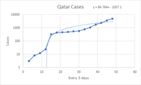
1587866880636.png

I'm going to base it off what I did last time as seen in post number 4 to find my equation manually.
My two chosen points near the trend line are (15,320) and (42,2376). Would this then generate our exponential equation?:
1587867284222.png

I put 3 as the value for x and I got the value = 1249522413878215
I'm really confused now - but when i use the excel generated equation and sub 3 for x I get the value 214 which is much closer than the one i did based on the steps I did through your site.
 
The trend line shown on your graph is not exponential but linear. You have to select "exponential" in Format Trendline. When you do so, it will look linear on the graph, because that is why we use semi-log graphs to display exponential functions!

You are forgetting that 15 is not the Y-intercept. Use the point-slope form, or equivalent.
ok, that makes sense. This would be what the updated version looks like.
1587885672654.png
 
Last edited:
How do I find the Y intercepts? Would I use 2 points and then use gradient formula and sub them into y=mx+b
I know it's cheating but if I do the points (12,24) and (39,1832) and using an online calculator my equation of the line is y=1808/27x - 7016/9. This would mean that my y intercept would be -7016/9.

I used this video as an example for my exponential equation and i got the equation below


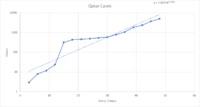
1587887606755.png
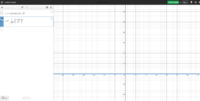
And for some reason on Desmos I get or subbing in values I get 0
1587887635547.png
 
Last edited:
ok, that makes sense. This would be what the updated version looks like.
View attachment 18191
Last time, you used days 15 and 42 for your line, which is a reasonable choice because of the major change in behavior after day 14. To do the equivalent with Excel, you could make a graph restricted to data starting day 15 or so. Then you can compare the equation you get that way with what you get manually, using two points near that line.

How do I find the Y intercepts? Would I use 2 points and then use gradient formula and sub them into y=mx+b
I know it's cheating but if I do the points (12,24) and (39,1832) and using an online calculator my equation of the line is y=1808/27x - 7016/9. This would mean that my y intercept would be -7016/9.
...
And for some reason on Desmos I get or subbing in values I get 0
The two best-known ways to find the equation given two points other than intercepts are (a) the point-slope form, which I mentioned (but you apparently have not seen), and (b) substituting one point into y = mx + b with the known m, and solving for b, which I think is what you did.

But you seem to be forgetting that the linear equation is for Y = log(y), not for the original y; so the slope is found using logs, not the actual values. (And if you use base 10 logs here, remember to initially use 10, not e, when you transform into an exponential equation. There are some little mistakes in your work, but this is the main one. Alternatively, you can write the general exponential form and plug in the actual data directly there, then solve for the parameters.

There is enough complexity here that I would check at every step. For example, once you get a linear equation, check it against both of the points you used, before going to exponential.

Keep at it! There is a lot to learn here, and a lot of places to make mistakes (and then learn from those!).
 
Now you need to use differential calculus to determine the rates of change implied by your model. Find the gradient function associated with your model and make eight estimates as to the rate of change of the spread of the virus at those data-points.

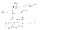
Say I have the exponential equation : y=21.5e^(0.1x) Note not based on the Qatar readings.
Can you verify if my process in finding the rate of change is correct. A second eye looking over is no harm I believe if you don't mind
1588234901841.png
then for the next bit "make eight estimates as to the rate of change of the spread of the virus at those data-points." i would input 8 x values into my equation to find my rate of change
1588235112600.png
 
Basically good. Don't write dy/dx on the first line, just d/dx; and check the number 2.92.
 
Basically good. Don't write dy/dx on the first line, just d/dx; and check the number 2.92.
Thanks for your help and I hope your are going well and keeping safe.
I have a second question

"Having developed a relevant model for the phenomenon, and found a gradient function, you need to assess its reliability. First, use residual analysis to determine the suitability of your model. Second apply residual analysis to your gradient function. You may have learnt about residual analysis last year, if not you will need to research it now. Plots and interpretations of residuals will be required."

How would I do a residual analysis of my gradient function. The tabulated values are my rates of change when I sub in x (day values) into my gradient function of y= 2.15e^0.1x
43.21
84.78
127.13
1610.65

I understand how a residual analysis s for my model but I am confused on how to do it for my gradient function. Would you please be able to explain how I can do a residual analysis for my gradient function. What would be my actual values for the rate of change? If I was to use actual data (raw data not model data) how do i find the rate of change of that?

Would our rate of change (based on raw values) follow something like this:
1589186020731.png
 
Top