Measure of how "concentrated" or "scattered" values are

BartV

New member
Joined
Jun 5, 2021
Messages
13
I'm looking for a measure (one single number) that represents how "concentrated" or "scattered" values are on a timeline.
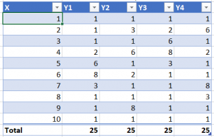
See below example, where X might be years for example, and Y a quantity.
In Y1 and Y2 the higher values are lumped together ("concentrated"), whereas in Y2 and Y4 they are "scattered". Intuitively I'd score Y1 and Y2 high (and equally high since their "concentratedness" is the same, although offset in time), and Y2 and Y4 low. How do I calculate such a measure, and does it even exist?
Any help would be greatly appreciated!
(I'd like to get this done in Excel so if you know of an Excel/M/Dax formula, please let me know).
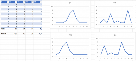
1631176022093.png
 
I'm looking for a measure (one single number) that represents how "concentrated" or "scattered" values are on a timeline.
See below example, where X might be years for example, and Y a quantity.
In Y1 and Y2 the higher values are lumped together ("concentrated"), whereas in Y2 and Y4 they are "scattered". Intuitively I'd score Y1 and Y2 high (and equally high since their "concentratedness" is the same, although offset in time), and Y2 and Y4 low. How do I calculate such a measure, and does it even exist?
Any help would be greatly appreciated!
(I'd like to get this done in Excel so if you know of an Excel/M/Dax formula, please let me know).
View attachment 28826
standard deviation could be one such measure.
 
I'm looking for a measure (one single number) that represents how "concentrated" or "scattered" values are on a timeline.
See below example, where X might be years for example, and Y a quantity.
In Y1 and Y2 the higher values are lumped together ("concentrated"), whereas in Y2 and Y4 they are "scattered". Intuitively I'd score Y1 and Y2 high (and equally high since their "concentratedness" is the same, although offset in time), and Y2 and Y4 low. How do I calculate such a measure, and does it even exist?
Any help would be greatly appreciated!
(I'd like to get this done in Excel so if you know of an Excel/M/Dax formula, please let me know).
View attachment 28826
Here is a list of such measures:
 
Thanks for answering! But I think dispersion measures are not what I need exactly? My charts are not distributions, but values on a timeline. Wouldn't the dispersion measures give the same results for all 4 datasets? Since the values and the frequency of the values in Y1 to Y4 are always equal. They're only differently organized along the X-axis (time).

Maybe if I would treat them as if they were distributions, and go for measures like skewness or something of the sort?
I started to add a comment to my answer, but deleted it; I should have left it in place!

No, this is not exactly a distribution; and yet it is. You didn't exactly indicate that Y is a frequency, but even if it isn't, you can treat it that way. (And by showing the totals of Y, you are really doing so.) And although the horizontal axis in a distribution is not usually a time, there is nothing wrong with it being so. In effect, if not in reality, X is a random time at which events counted by Y occur, and the mean of X is the average time at which they occur, just as it should be.

The standard deviation will certainly not be the same for your examples. I'm not talking about finding the standard deviation of the Y values, but of the X (time), treating Y as a frequency.
 
Yes, that's a very interesting idea to treat the data as a frequency table. So let's take X as the categories, and Y as the frequencies (f). As if these were not timelines but histograms.
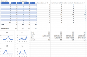
Based on this, I added some calculations to my sheet, see below. (Maybe I'm making some stupid mistakes, please let me know.)
To calculate the median, I sorted X according to the frequencies (Y).
In my data, interestingly enough, the median (as calculated by Excel) turns out to be four times the same, because 10 and 9 or 8 always turn up in the middle.
The mean is, of course, always the same.
So, as a result, the standard deviation turns out to be equal also... So strangely enough, I get four times the same statistical results...
Any ideas, corrections or remarks would be very welcome...
1631268425744.png
 
You need to take the weighted mean, not just the mean of the values of x. You aren't taking frequency into account. The same is true of the standard deviation, and even the median.

I don't have time right now to check how this can be done in Excel.
 
If you could just give me the general mathematical formula or approach, or one example for this case? I'll get it done in Excel, no problem with that.
 
I've had a ridiculously hard time trying to search for the right formula with a good explanation; there are several different formulas depending on the data you have. But this page should work:


Look for "Mean and Variance of a Discrete Distribution".

For a nicer explanation of the mean, which you might read first, see


EDIT:
Excel should have a formula to do this automatically, but you need to use the formulas. Here is an explanation:

 
Last edited:
That's great information, thanks! I'll get to work on this and post the results...
 
I've been working a bit further on this, and what I'm actually going to need is the Inter Quartile Range, based on a frequency table (in my specific case using my weeks as categories or bins, and my quantities as frequencies, which is what they actually are).
I found some nice explanations on how to do this mathematically (Quartiles & Median From Frequency Tables, or this video for a more "manual" approach), so theoretically that's clear.
I'm a bit at a loss however on how I can get this done in Excel... But that's not really within the scope of this forum, I guess. If anyone would know how, I'm still interested. Apart from that, I consider my question answered. Thanks for your help, it was most useful!
 
I've been working a bit further on this, and what I'm actually going to need is the Inter Quartile Range, based on a frequency table (in my specific case using my weeks as categories or bins, and my quantities as frequencies, which is what they actually are).
I found some nice explanations on how to do this mathematically (Quartiles & Median From Frequency Tables, or this video for a more "manual" approach), so theoretically that's clear.
Yes, that was one of the options listed in my initial answer.

I'm a bit at a loss however on how I can get this done in Excel... But that's not really within the scope of this forum, I guess. If anyone would know how, I'm still interested. Apart from that, I consider my question answered. Thanks for your help, it was most useful!
I don't think the first does what you want; it deals with grouped data and how to approximate quartiles when you already know which group they are in. I haven't watched the video, but it looks more likely to give the appropriate method, which can be translated to Excel.

I would expect to make a column for cumulative frequency and use some form of lookup to find the quartiles. I haven't found an explicit explanation of this anywhere, though someone surely has done it. (I don't know why Google can't handle a request like "iqr with frequencies in excel" or "quartiles with frequencies in excel", and actually give me pages that fit that description.)
 
I asked in the Excel group and got the Excel part all worked out with their help. For those interested, see Percentiles from frequency table. (It involves Power Query btw. For a solution without Power Query, see this blog post: Learn How to Calculate the Median from a Frequency Table in Excel.)
Thanks for helping me out @Dr.Peterson ! You gave me the valuable insights that were crucial to getting it done!
The blog post method, of course, will work as long as the frequencies aren't too big! It's rightly called a "hack" on the other page. It would be fine for your example, but the method I have in mind would be more general, and should not be hard at all. I'm going to work on it for myself, even though you consider yourself finished.

I would, however, be interested in the answers you got for your examples (or some other data), just to verify that what you are finding is what you say it is.
 
OK, I'd be interested in your results.
In my preliminary results the IQR seems to perform well for my objective, but I can't share that data. If you'd like, I can apply the Excel method with the Power Query on my mini sample data I posted here earlier...
 
OK, I'd be interested in your results.
In my preliminary results the IQR seems to perform well for my objective, but I can't share that data. If you'd like, I can apply the Excel method with the Power Query on my mini sample data I posted here earlier...
That would be good, although the numbers may be too small to be interesting. You might make up a data set that looks more like your real data (or just use your data without identifying what it means).
 
Here's how I do it in Excel (using Power Query). (I'd add the workbook but the site won't let me upload Excel spreadsheets).
From the original data:
1631526064932.png
I make "expanded" lists back to the original observations:
1631526097229.png
on which it is easy to calculate the percentiles (and other statistics) with built-in formulas (either Power Query or Excel):
1631526155147.png
(see my post Percentiles from frequency table in the Excel group for details on the Power Query).

Both the IQR and StDev give a nice representation of how concentrated the values are.
 
P.S. Of course, if the values in the Y columns would range into thousands or millions, you couldn't do this because the expanded lists would become too big. In that case I would either do an approximation (crunching the Y-range into 0 to 100 for instance, by dividing the whole range by eg. 1000 and rounding), or maybe a more precise approach could be found by translating the math formulas in Quartiles & Median From Frequency Tables in Excel. Which is a nice challenge, but not needed for my specific case so I'll leave the challenge to someone else for the moment ;).
 
I took the challenge because it's ridiculous that no one would have posted the simple direct approach for quartiles anywhere that I could find.

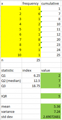
Here is my spreadsheet (with your last example as data):

1631545447472.png

Here are the formulas:

x​
frequency​
cumulative​
1​
1​
=SUM(B$2:B2)​
2​
6​
=SUM(B$2:B3)​
3​
1​
=SUM(B$2:B4)​
4​
2​
=SUM(B$2:B5)​
5​
1​
=SUM(B$2:B6)​
6​
1​
=SUM(B$2:B7)​
7​
8​
=SUM(B$2:B8)​
8​
3​
=SUM(B$2:B9)​
9​
1​
=SUM(B$2:B10)​
10​
1​
=SUM(B$2:B11)​
n​
=SUM(B2:B11)​
statistic​
index​
value​
Q1​
=B$12/4​
=INDEX(A$2:A$11,MATCH(B15,C$2:C$11,1)+1,1)​
Q2 (median)​
=2*B$12/4​
=INDEX(A$2:A$11,MATCH(B16,C$2:C$11,1)+1,1)​
Q3​
=3*B$12/4​
=INDEX(A$2:A$11,MATCH(B17,C$2:C$11,1)+1,1)​
IQR​
=C17-C15​
mean​
=SUMPRODUCT(A2:A11,B2:B11)/SUM(B2:B11)​
variance​
=SUMPRODUCT((A2:A11-C21)^2, B2:B11)/(SUM(B2:B11)-1)​
std dev​
=SQRT(C22)​

The quartiles might need some tweaking, but they're good enough for me.

Incidentally, my concern about using the IQR for your purposes (if your data looked like the examples) is that it is a coarse measure, being a small integer, that doesn't distinguish fine differences.
 
Interesting, instead of expanding the lists you do a cumulative sum, might work better in terms of performance.
My data ranges from 1-53 (weeks) for X. I suppose you would recommend Std Dev then, rather than IQR?
 
Top