Miguel tracked how much sleep he got for 50 consecutive days.....

eddy2017

Elite Member
Joined
Oct 27, 2017
Messages
2,525
Hi, the following problem is from khan academy

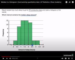
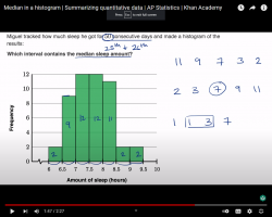
Miguel tracked how much sleep he got for 50 consecutive days and made a histogram of the results.
Which interval contains the median sleep amount?

1645813387328.png
this is the histogram we have to find out which of those intervals at the bottom contains the median of sleep amount.
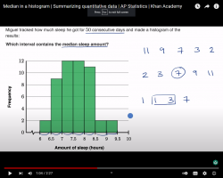
Dr Khan goes on to remind us how we find the median
and he does an example on the right hand side
1645813572845.png

in this situatioin Miguel has an even number of data points
he goes on to explain that the median would be the mean of the 25th and 26th data points
I understand this perfectly well becuase I am fresh from doing a problem on the forum about tHIS
So, 25th and 26th would be t he two midlle data points
and then he asks: which intervla here contains the 25th and the 26th datapoints

then, he says : well, we can start at the bottom and let's take a look at each interval and find out how many data points it has;
and then he writes how many data points each interval has.
the first interval has 2
the second interval has 9
the third and fourth have 12 and so forth and so oon.
I am pasting a screenshot of that here.
my question is :
How does he know how many data points each interval has?. How does get every amount for every interval?.
I did not understand that.
Thanks for any help in advance and sorry for bringing this up in my other thread. I thought it had to do with the question at hand. My apologies.
1645814219069.png
 
Last edited:
How does he know how many data points there are? He looks at the bar graph! The vertical axis is labelled Frequency.

Can you list all the 50 data points?
 
How does he know how many data points there are? He looks at the bar graph! The vertical axis is labelled Frequency.

Can you list all the 50 data points?
I am trying to understand how gets 9, how he gets 12.
I don't see the connection with the frequency axis.
 
I am trying to understand how gets 9, how he gets 12.
I don't see the connection with the frequency axis.
What mathematical thing he does do, if any, to know the second interval has 9 data points?
 
What mathematical thing he does do, if any, to know the second interval has 9 data points?
If you did have the original data points, you would see that there are 9 data points with values between 6.5 to 7 (hours of sleep).

He counts the actual data points, prior to plotting the histogram.
 
If you did have the original data points, you would see that there are 9 data points with values between 6.5 to 7 (hours of sleep).

He counts the actual data points, prior to plotting the histogram.
but he doesn't give the original data points. but interesting insight. Thanks a lot.
 
I will finish up watching and studying the video and then will ask you any doubt about the rest of it. it is a short video. I think this data-points -for every-interval doubt cleared it will be smooth sailing from here on. I guess, not so sure.
and then I will ask Steven what role the frequency axis plays in all this.
thanks!
 
This is a very typical type of histogram.

On the left hand side, there is a scale showing how many data points or what fraction of total data points are in a category.

The categories may be (and usually are) ranges of values rather than point values.

Here the number of data points is relatively small so the exact number of data points is specified in the scale to the left. The categories are given in half hour ranges.

Histograms are somewhat flexible. If we had 50,000 data points, we would probably scale the left in units of 5000 or 2500. With just 50, we give the exact number.

If we are being serious about presentation, we would give a detailed table in addition to the histogram, which is designed to give an overall impression of the data.
Thanks for the explanation, Jeff. Very interesting. I will dig into histogram a little bit more.
 
Do a Google search!

What is the purpose of drawing histogram of data?

Tell us what did you learn from the first 3 posts.
 
Can you follow the procedure I posted in your other thread to find the median in this case?
 
I had enough! I will list the 50 data points.
6.25, 6.25, 6.75, 6.75, 6.75, 6.75, 6.75, 6.75, 6.75, 6.75, 6.75, 7.25, 7.25, 7.25, 7.25, 7.25, 7.25, 7.25, 7.25, 7.25, 7.25, 7.25, 7.25, 7.75, 7.75, 7.75, 7.75, 7.75, 7.75, 7.75, 7.75, 7.75, 7.75, 7.75, 7.75, 8.25, 8.25, 8.25, 8.25, 8.25, 8.25, 8.25, 8.25, 8.25, 8.25, 8.25, 8.75, 8.75, 9.25, 9.25
I get it my friend, but we do not actually know the exact value of even a single data point. All we know in this case are ranges.
 
Do a Google search!

What is the purpose of drawing histogram of data?

Tell us what did you learn from the first 3 posts.
good morning to all

what is a histogram? . Purpose?

it is a type of bar graph that shows how frequently data occurs within certain intervals.
ANALYSIS OF A COMON HISTOGRAM
the height of the bar gives the frequency in the intervals

Histograms have interval of equal size that do not overlap
I am going to write an example here for future visitors of the op

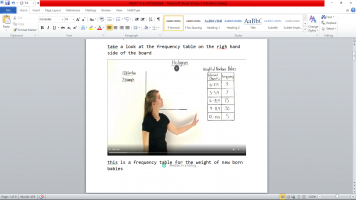
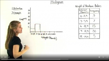
take a look at the frequency table on the right hand side of the board
1645884527374.png

in the first column we have the interval in pounds

in the next column we have the frequency

our first interval goes from 0 to 2.9 pounds

the frequency tell us that there 3 babies that have a weight between 0 and 2.9pds

next we have a frequency of 7 which tells us that there ae 7 babies which weight ranges from 3 and 5.9

notice that each interval is of the same size

also notice that the intervals do not overlap

the first interval ends at 2.9 and the next one begins at 3 and so forth and so on


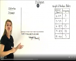
let’s take this frequency table and turn it into a histogram
1645884651953.png
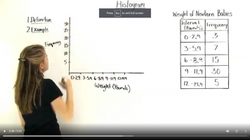
we write the intervals along the x axis

We write the frequency on the y-axis

The number of times it occurs within the interval

Our frequency ranges from 3 all the way up to 30


1645884688229.png

Let’s take a look

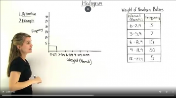
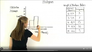
The frequency from 0 to 2.9 is 3 so

Our first bar goes all the way up to 3
 

Attachments

  • 1645884720237.png
    1645884720237.png
    334.2 KB · Views: 0
Next, we have 7 babies within 3 to 5.9

So our next bar goes all the way to 7
1645884801050.png


And notice how our bars touch

Next, a frequency of 15 for babies bt 6 and 8.9

So we go all the way up to 15

1645884841595.png

Next 30 betweent 9 and 11.9

Then we go all the way up to 30
1645884889026.png

And last 5 bt 12-14.9 so

We go all the way up to 5 again
1645884924217.png

This is a histogram

The height of the bar is the frequency bt our intervals

Let’s go ahead and take a look at the different types of histograms

They can be described based on their shape

A uniform histogram: got bars of similar height

A symmetric histogram: where bars center around a central bar

A skewed histogram: One that picks toward the high end (values are clusterd around the high point here or towards the low end ( values clustered around the low point)

When are histograms useful?

When we have a lot of different data points so it makes more sense to group them into intervals

Like here where we have a lot of different weights so makes more sense to group them into intervals and take the frequency of each interval

Examples of histograms

Household income in dollars

Money spent in the supermarket

Finished times for a race

Sorry for the long explanation. Now I fully understand what Doc Khan's video. Just like Jeff said: not so difficult at all!
 
Top