thepapercup
New member
- Joined
- Sep 7, 2008
- Messages
- 9
Okay, I feel weird asking this kind of question because I know there's a very simple answer to it, but I'm just hoping to find out a quick way to set this question up.
Here we go:
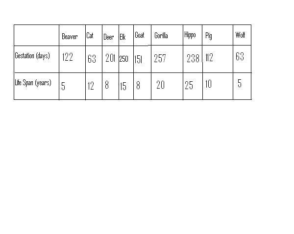
Make a scatter plot of the data
I'm just wondering what you all think the most efficient way to set this graph up is.
It's supposed to be on one scatter plot.
Thank you for your time.
~Lori
Here we go:
Make a scatter plot of the data
I'm just wondering what you all think the most efficient way to set this graph up is.
It's supposed to be on one scatter plot.
Thank you for your time.
~Lori
")